Technical SEO
Mobile SEO and Usability Optimization
Google indexes the mobile version of your site, not the desktop one
- Timeline
- Most mobile fixes ship in 4 to 6 weeks
Call (714) 823-3164 or ask a question. Clear recommendations, even if we never work together.
Mobile optimization makes a website work correctly on phones. That matters because Google indexes the phone version, and most local customers browse on a phone. It covers responsive layout, tap target sizing, readable text, and content parity with desktop. It also covers mobile form usability and fast access to a click to call button.
The problem
Google switched to mobile first indexing years ago, which means the mobile version of your site is the version that decides your rankings. Plenty of service business sites hide content on mobile to save space, which effectively deletes it from Google's view. Beyond indexing, the experience itself fails: a phone number that is text instead of a tap to call link, buttons crowded so close a thumb hits the wrong one, a form asking for eight fields on a five inch screen, and a sticky header eating a third of the viewport. The customer is standing in a driveway with one hand free. Any friction sends them to the next result.
What it is
Mobile work has two halves, and people mix them up. The indexing half is about parity. The mobile version has to carry the same text, images, headings, structured data, and internal links as desktop. Anything missing on mobile is missing from Google's index. The usability half is about the person holding the phone. Tap targets need to be at least 48 pixels, with space between them. Body text needs to be 16 pixels or larger so nobody has to zoom. Forms need the right input types, so the phone shows a number pad for phone fields. A call button should stay on screen without scrolling, and layouts should not shift while loading. We test on real devices and in Chrome DevTools device mode, not just by resizing a browser window.
Signs you need this
- Mobile traffic is high and mobile conversions are much lower than desktop
- You hide sections of content on mobile to save space
- Your phone number is plain text instead of a tappable link
- Visitors have to pinch and zoom to read your service pages
- Your mobile menu takes three taps to reach a service page

What is included
- Mobile versus desktop content parity comparison
- Tap target sizing and spacing corrections
- Font size and contrast fixes for readability without zoom
- Sticky click to call bar with tracked tel links
- Mobile form field types and keyboard optimization
- Viewport and horizontal scroll fixes
- Responsive image srcset implementation
- Real device testing on iOS Safari and Android Chrome
- Mobile navigation and menu depth simplification
Our process
Parity check
Week 1We crawl the site twice, once with a desktop user agent and once with a smartphone user agent, then compare word counts, headings, links, and structured data. Anything present on one and missing on the other gets flagged.
Device testing
Week 1 to 2Key pages get walked through on real phones, an older Android and a current iPhone, on cellular rather than wifi. We record the sessions so you can watch where a thumb misses a button or a form fights the keyboard.
Layout and interaction fixes
Week 2 to 5Tap targets get resized, text gets scaled up, horizontal scroll gets eliminated, and navigation gets flattened so the most common actions are reachable in one or two taps.
Call and form flow
Week 3 to 6A sticky call button gets added with proper tel links and click tracking. Forms get shortened for mobile, given correct input types, and tested for autofill so a customer can complete one at a stoplight.
Verify and monitor
Week 5 to 12We recheck mobile usability in Search Console and Lighthouse, and watch mobile conversion rate against desktop for the following two months to confirm the changes did what we expected.
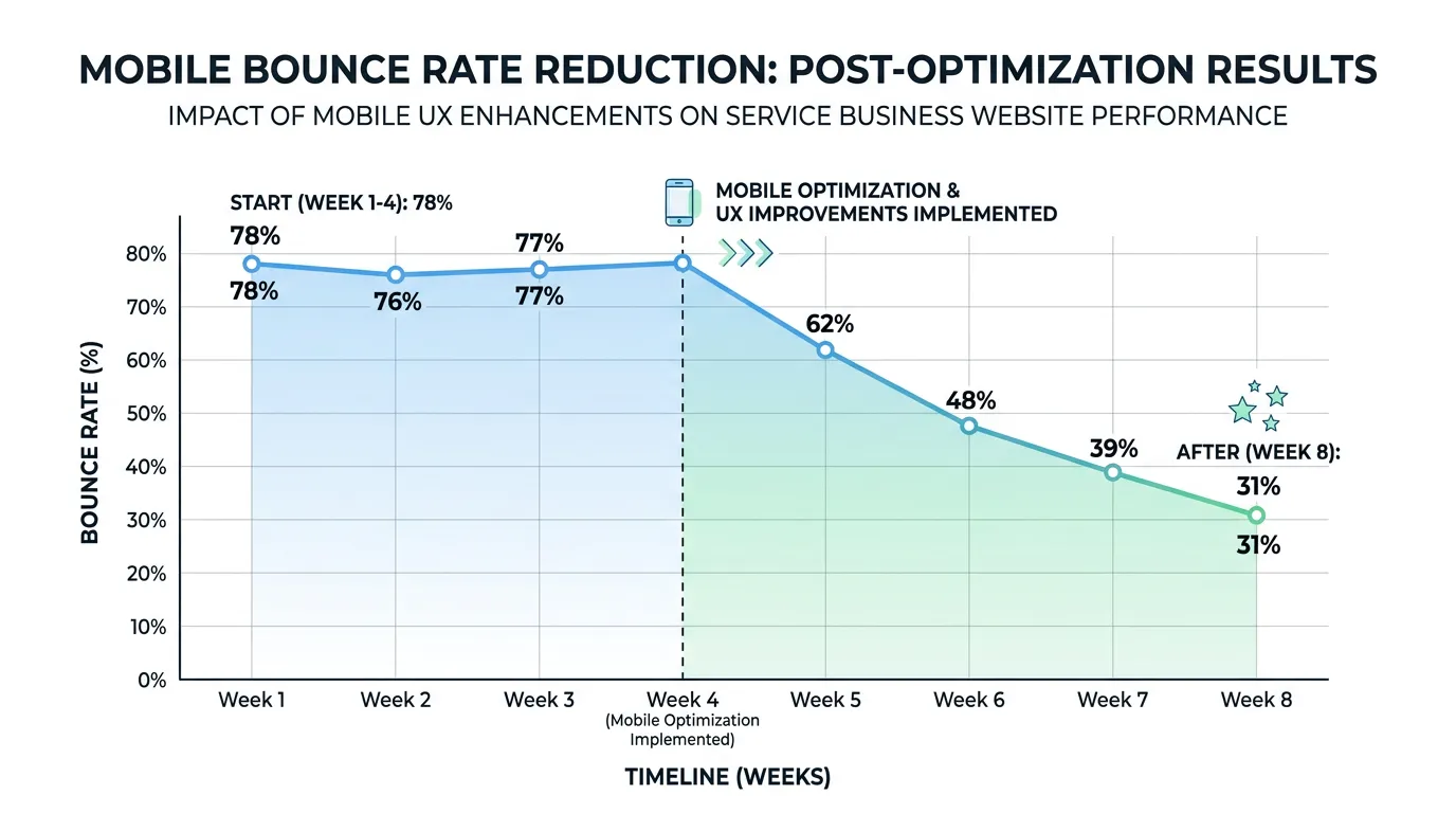
Realistic timeline: Most mobile fixes ship in 4 to 6 weeks. Conversion effects show within 30 to 60 days once enough mobile sessions accumulate. Indexing effects from restored content parity follow the next full recrawl, usually 2 to 6 weeks.
The Mobile Path From Tap to Call
Every mobile visitor walks the same short path. Each step loses people, and the technical cause is different at each one.
Each drop off has its own fix. Speed work will not help a visitor who cannot find the call button.
Input Settings That Change the Phone Keyboard
A mobile form gets easier the moment the right keyboard appears. These are the attributes that do it, and they take minutes to add.
| Form field | Set this | What the visitor gets | Why it matters |
|---|---|---|---|
| Phone number | type="tel" plus autocomplete="tel" | A number pad, with their own number offered | Turns the slowest field into one tap |
| type="email" plus autocomplete="email" | A keyboard with the at sign ready | Fewer typos, so fewer dead leads | |
| Name | autocomplete="name" | Their saved name above the keys | Removes two fields worth of typing |
| Street address | autocomplete="street-address" | The full saved address offered | The biggest single time saver on mobile |
| Zip code | inputmode="numeric" | A number pad instead of letters | No switching keyboards partway through |
| Message | A plain textarea, kept optional | The standard keyboard | Long typing on a phone stalls people |
These are standard HTML attributes supported by iOS Safari and Android Chrome. Test after adding, since some form plugins strip them.
Design for One Thumb, Not Two Hands
Most people hold a phone in one hand and use the thumb of that same hand. The comfortable zone is the bottom two thirds of the screen, leaning toward the side the thumb comes from. Anything parked in the top corners needs a grip change first.
That has plain consequences. The call button belongs near the bottom of the screen, not tucked inside the header. Important links belong in the flow of the page, not only behind a menu icon. Long forms should put the easy fields first, because people quit partway through, not before they start.
It also changes how you test. Shrinking a browser window on a laptop shows you the layout. It never shows you that the submit button sits under the keyboard, or that the phone field opens a letter keyboard. Hold a real phone in one hand and try to book yourself.
Mobile Choices That Help or Hurt
The gap between a mobile site that earns calls and one that does not usually comes down to a handful of decisions.
Do this
- Keep the same text, headings, images, and links on mobile as on desktop.
- Put a tap to call button where a thumb reaches without scrolling.
- Size tap targets at about 48 pixels with clear space between them.
- Set body text at 16 pixels or larger so nobody has to zoom.
- Give images and embeds fixed dimensions so the page does not jump.
Not this
- Do not hide content on small screens to tidy up the design.
- Do not put your phone number inside an image or a script.
- Do not fire a popup before the visitor has read anything.
- Do not ask for eight form fields when a name and a phone number would do.
- Do not let a sticky header and a sticky bar eat half the screen.
More Mobile Questions
Does my business need a mobile app?
Do tablets need their own attention?