Web Design and Development
Mobile First Website Design
Phone layout designed first, desktop expanded from it
- Timeline
- Built into a full design project at no separate timeline
Call (714) 823-3164 or ask a question. Clear recommendations, even if we never work together.
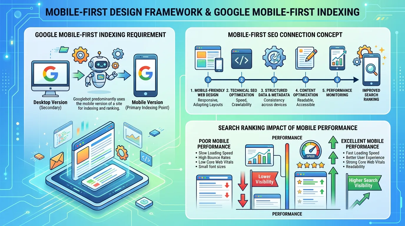
Mobile first design means designing the phone layout first, then expanding it to desktop. It is the opposite of shrinking a desktop design down. It matters for local service businesses because most searches happen on a phone. Those visits often happen outdoors on a weak connection, and the visitor wants to tap a number and talk to someone.
The problem
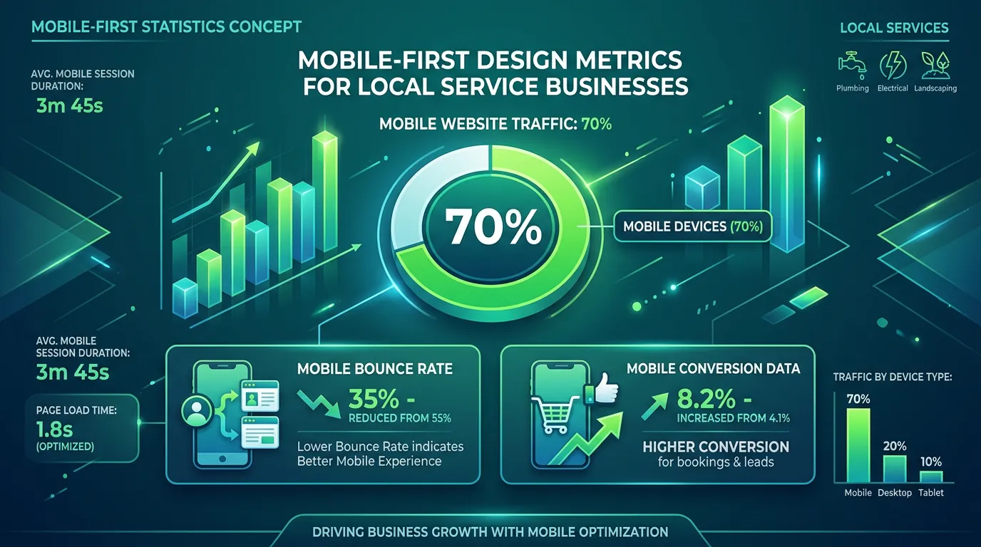
Between 60 and 80 percent of visits to a local service website come from a phone, and most of those sites were designed on a 27 inch monitor. The result is predictable. The phone number is an image, not a tappable link. The menu button is a tiny icon in the corner. The hero text stacks into eight lines and pushes the call to action three scrolls down. The form fields are too small to tap accurately with a thumb. A homeowner standing in a flooded laundry room gives it four seconds, then taps back and calls the next company.
What it is
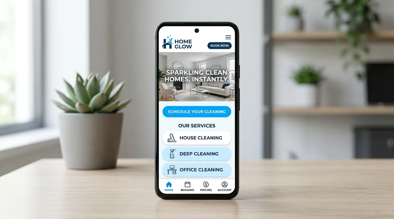
Mobile first design starts every layout at 375 pixels wide and works up. That constraint forces hard decisions early. You decide what actually belongs above the fold. You decide which of your eight services matters most. And you decide how much text a person will read standing in a driveway. We design for the thumb zone and keep tap targets at least 44 pixels. We put a call bar at the bottom of the screen that stays visible while the visitor scrolls. The menu opens fast and shows the phone number first. Then we test on real devices, not just a resized desktop browser window. That includes an older Android on a slow connection.
Signs you need this
- Your mobile bounce rate is well above your desktop bounce rate
- Your phone number cannot be tapped to call on a phone
- You have to pinch and zoom to read your own site
- The menu takes two taps and a scroll before the contact page appears
- Analytics shows most traffic is mobile but most conversions are desktop
What is included
- All layouts designed at phone width first, then expanded to tablet and desktop
- Sticky bottom call bar with tap to call and tap to text where you support it
- Tap targets sized to at least 44 by 44 pixels with adequate spacing
- Mobile navigation that opens instantly and leads with the phone number
- Forms with correct input types so the right keyboard appears for phone and email
- Image sizes served per device so phones never download desktop resolution files
- Font sizes set for readability at arm's length, minimum 16 pixels on body text
- Real device testing on current and three year old iPhone and Android hardware
- Throttled connection testing at 4G and slow 4G speeds
Our process
Mobile Behavior Review
Days 1 to 4We pull your analytics to see the device split, the mobile bounce rate, and which pages lose people fastest on a phone. That tells us where the real damage is before we redesign anything.
Phone Width Design
Week 1 to 3Every page is designed at 375 pixels first. If a section does not earn its space on a phone screen, it usually does not belong on desktop either, and this is where that gets decided.
Interaction Build
Week 3 to 5We build the sticky call bar, the mobile menu, the form keyboards, and the tap states, then check that nothing important sits in the top corners where a thumb cannot comfortably reach.
Real Device Testing
Week 5 to 6We open the site on actual phones, including an older Android, and on throttled connections. Emulators miss touch behavior, iOS Safari quirks, and how bad a site feels at slow 4G speeds.
Field Data Check
Days 1 to 28 after launchAfter launch we watch Core Web Vitals field data in Search Console, which reports what real phone users experienced rather than a lab score.
Realistic timeline: Built into a full design project at no separate timeline. As a retrofit on an existing site, three to six weeks depending on how the current layout was coded.
The Path From Search Result to Phone Call
Most mobile visits last under a minute. This is the whole path a phone visitor takes, and every step has to survive a weak signal in someone's driveway.
Anything on the page that does not help a thumb reach step five is competing with step five.
Test Your Own Site the Way a Customer Does
Do this on your own phone, standing outside, not at your desk on office wifi. Eight checks, about ten minutes.
Turn wifi off first
Cell data is the real test. Office wifi hides a slow site.
Time the first thing you see
Count out loud. Past three seconds you are losing people.
Tap the phone number
It should start a call, not open a contact page or nothing.
Reach both top corners with one thumb
If the menu needs two hands, it sits in the wrong place.
Fill out the form standing up
The wrong keyboard for a phone field is a common miss.
Read the body text at arm's length
Under 16 pixels and older customers pinch to zoom.
Scroll fast and watch for jumps
Content that shifts means images have no set size.
Hand the phone to someone else
Ask them to find your service area. Time how long it takes.
What a Weak Signal Actually Does to Your Page
Speed tests report an average. Real life is not average. A customer standing behind a house on a three year old Android with one bar of signal is loading your site on a far slower connection than the one in your office.
On that connection, order matters more than total size. A page that shows text first and images second feels usable in about two seconds. A page that waits on one huge hero photo shows a white screen the whole time, even when both pages weigh the same.
So we set fonts to show fallback text while they load, and we serve the hero image at a phone sized version. The visitor gets something to read while the rest of the page arrives.
Mobile Layout Rules We Do Not Bend
These come up on every build. We hold the line on all of them, and here is why each one matters.
Do this
- Put the phone number in the header as real text on every page
- Keep tap targets at least 44 pixels with space between them
- Use tel and mailto links so the phone does the work
- Set the input type so a number pad appears for a phone field
- Stack the mobile first screen: headline, one line of proof, one button
Not this
- Do not bury your phone number inside a logo image
- Do not fire a popup in the mobile first ten seconds on a phone
- Do not hide the service area behind a menu
- Do not put a carousel on the mobile first screen, people swipe past it
- Do not test only in a desktop browser squeezed to phone width
Mobile Questions Owners Ask
My mobile bounce rate is 78 percent. Is that bad?
Should the mobile menu match the desktop menu?
Do I need a mobile app?