Web Design and Development
Conversion Focused Website Design
One obvious next step on every screen of every page
- Timeline
- Runs alongside design at no separate schedule
Call (714) 823-3164 or ask a question. Clear recommendations, even if we never work together.
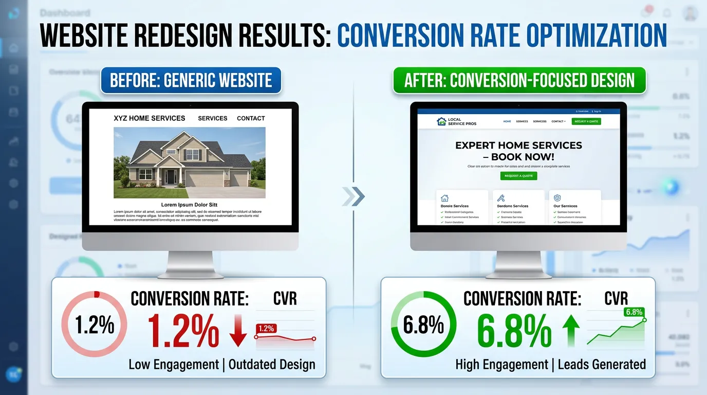
Conversion focused design means designing every page around one next step: call, book, or submit. We pick the layout, headline order, proof placement, form length, and button contrast. Each choice is made to cut hesitation. It separates a site that looks professional from one that produces leads.
The problem
Plenty of good looking websites produce almost nothing. The homepage opens with a full width photo and the words Welcome To Our Website. The phone number sits in small gray text in the top corner. Reviews are on a separate testimonials page nobody visits. The contact form asks for eleven fields including preferred contact method and how did you hear about us. Every one of those choices is defensible on its own, and together they take a visitor who was ready to call and give them four small reasons to leave instead.
What it is
Conversion focused design applies the same set of decisions to every page. Say what you do and where you do it in the first screen. Put the phone number in the header as tappable text. Give each page one primary action, repeated at natural decision points. Place proof next to the claim it supports, not in a testimonial ghetto. Cut forms to the minimum. Remove links that lead away from the lead path. We also design the states most sites forget. That means what a form error looks like and what the thank you page says. It also means what happens when someone lands on a page for a service you do not offer in their city.
Signs you need this
- Traffic is steady but call volume has not moved in a year
- Your homepage opens with a slideshow and a welcome message
- Your contact form asks for more than five fields
- Reviews live only on a separate testimonials page
- Visitors call and ask questions your website already answers, meaning they never found the answer
What is included
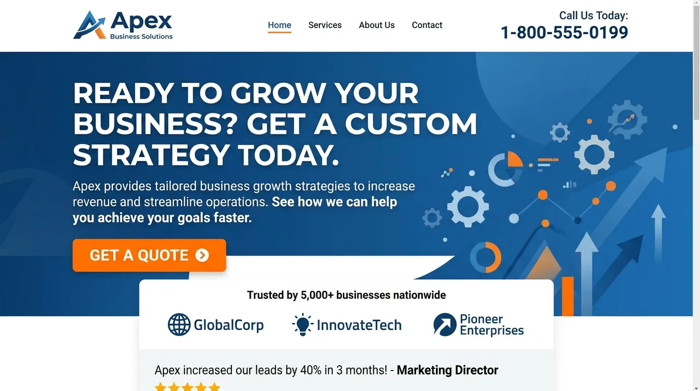
- First screen block on every page with the offer, the conversion focused service area, and a tappable phone number
- Primary and secondary call to action hierarchy with contrast checked button styles
- Proof blocks placed next to the claims they support, using real review quotes
- Trust row with license number, insurance, years in business, and review count
- Short form design with inline validation and clear error states
- Thank you page designed to set expectations about response time
- Repeated call to action at each natural scroll break on long pages
- Removal or reduction of links that pull visitors off the lead path
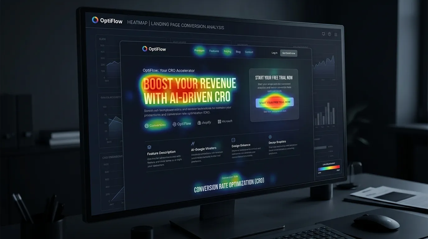
- Heatmap and session recording setup to see where visitors actually stall
Our process
Lead Path Mapping
Days 1 to 5We trace every way a visitor can currently become a lead and count the steps each one takes. Most sites have one buried path and several dead ends. This map decides what the design has to fix.
Objection Inventory
Week 1 to 2We ask your sales staff and office manager what people hesitate about: price, timing, licensing, whether you serve their city, financing. Each objection becomes a block placed where hesitation happens on the page.
Design the Decision Points
Week 2 to 4We design the first screen, the proof blocks, the form, the error states, and the thank you page. These few elements carry most of the conversion outcome, so they get more attention than decorative sections.
Build and Instrument
Week 4 to 6Pages get built with heatmaps, scroll depth tracking, and session recording in place from day one, so within a month we can see where people stop rather than guess.
Read the Recordings
Days 30 to 45 after launchThirty days after launch we watch real sessions, especially ones that ended without a conversion, and adjust the specific block where people stall.
Realistic timeline: Runs alongside design at no separate schedule. On an existing site, four to six weeks to redesign the key pages. First reliable read on conversion change after 30 days of traffic.
One Page, One Job
Every page type on a service site has a different job. Mixing those jobs is what makes a site feel busy and convert poorly.
| Page type | Primary action | What to remove | How you know it works |
|---|---|---|---|
| Homepage | Call, tapped from the header | Slideshows and welcome copy | Tap to call events per visit |
| Service page | Call or quote request | Links to unrelated services | Form starts versus form finishes |
| Service area page | Call, with the city named | A copy of the full service list | Calls that mention that city |
| About page | Call, right after the trust block | Long company history | Visits that continue to contact |
| Contact page | Short form or call | A map that loads before the form | Completed forms per visit |
Two actions on a page is fine. Two equal actions is not, because the visitor has to decide, and deciding is where people leave.
Put the Answer Where the Doubt Is
Proof works when it sits next to the claim it supports. A review that mentions a clean job site belongs under the paragraph about protecting floors, not on a page called Testimonials that almost nobody opens.
Objections work the same way. If people ask about price on every call, a price range belongs on the conversion focused service page, high enough that a phone visitor sees it. Hiding it does not stop the question. It moves the question to a competitor who answered it.
We build that list from your own staff, not from research. Ask whoever answers the phone to write down the first question every caller asks, for two weeks. That page of notes is worth more than any survey, because it is the real language your customers use.
Call to Action Rules
Button copy is small work with large effects. These rules hold on nearly every service site we build.
Do this
- Name the action and the outcome: Call for a same day quote
- Repeat the button at each natural scroll break
- Make the primary button the only thing in that color
- Say what happens next in small text under the form button
- Give the phone option the same weight as the form
Not this
- Do not use Submit, Learn More, or Click Here
- Do not place two same colored buttons side by side
- Do not ask for a budget before you have earned the lead
- Do not route form leads to an inbox nobody checks after five
- Do not use a thank you page that only says thank you
A visitor stuck between two equally loud buttons usually picks the third option, which is leaving.
Measuring the Change
How long before I can tell if the new design converts better?
Should I count phone calls or only form fills?
What if my traffic is too small to test?