Lead Generation Systems
Conversion Path Design
Designs the on site route, not the individual form
- Timeline
- Analysis and mapping in weeks 1 to 3, implementation through week 10
Call (714) 823-3164 or ask a question. Clear recommendations, even if we never work together.
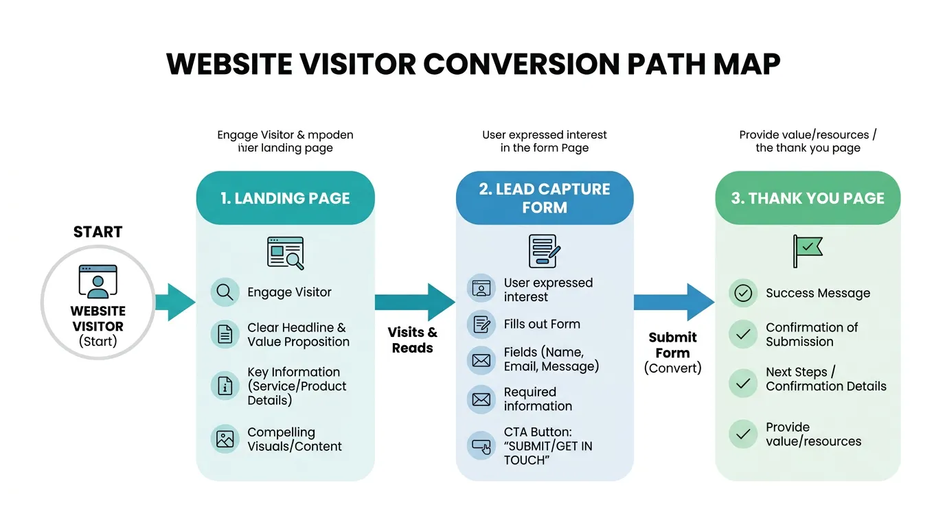
Conversion path design is planning the route a visitor takes through your website, from the page they land on to the moment they contact you. It sets the entry points and the next step on every page. It also ranks the calls to action and decides how many clicks stand between interest and action.
The problem
Website planning usually assumes everyone starts at the homepage and works down a menu. Real traffic does not behave that way. People land on a blog post about slab leaks, a city page, or a service page straight from search, and that page treats them like they already know who you are. There is no next step, or there are nine competing ones: a newsletter box, a chat bubble, a phone number, a quote form, a financing link, and a social icon row. When everything is emphasized, nothing is. The visitor scrolls to the bottom, finds nothing to do, and goes back to the search results.
What it is
Conversion path design starts with data on where people actually enter your site and what they do next. We pull top landing pages and exit pages from GA4. Then we map the intended route from each real entry point to a contact action. Every page on that route gets one primary call to action and at most one secondary, styled so the difference is obvious. Blog posts get a next step tied to the topic. A slab leak article offers a leak detection appointment, not a generic contact link. Service pages get contact options where the reader has enough information to act, not only at the bottom. Navigation, internal links, and thank you pages are all part of the route, not separate decisions.
Signs you need this
- Your blog posts have no relevant next step for a reader who is interested
- Pages have four or more competing calls to action of equal weight
- Analytics shows high traffic pages with almost no onward clicks
- Reaching your contact form takes three or more clicks from a service page
- Your thank you page says thank you and nothing else
What is included
- Entry point analysis of your top 20 landing pages by traffic and by conversion
- Mapped route from each significant entry point to a contact action
- One primary call to action assigned per page with a defined secondary
- Contextual next steps on blog and resource pages tied to the topic
- Call to action placement at scroll depths where readers are ready to act
- Navigation and internal link review to shorten the route
- Exit page analysis showing where the route currently breaks
- Thank you page design with a real next step instead of a dead end
- Scroll depth and click tracking to verify people reach the action
- Conversion path documentation your web team can maintain after handoff
Our process
Find the Real Entrances
Week 1We pull landing page data from GA4 and Search Console. On most service sites the homepage is not the top entry point, and several high traffic pages have no conversion path to contact at all.
Map the Intended Route
Week 1 to 3For each significant entrance we write out the route we want: this page, then this page, then contact. Anything requiring more than two steps gets simplified, because every extra click loses people.
Set the Hierarchy
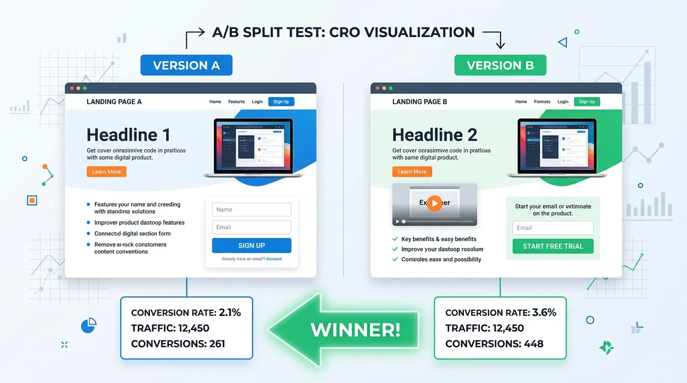
Week 3 to 5Each page gets one primary action and one secondary, and the design gets adjusted so the primary is visually dominant. Removing competing calls to action often lifts conversions more than adding new ones.
Add Contextual Next Steps
Week 4 to 7Articles and resource pages get an offer that matches the topic. Someone reading about panel upgrades should be invited to book an electrical assessment, not handed a generic contact button.
Verify With Behavior Data
Week 6 to 9Scroll depth and click tracking confirm whether visitors ever reach the action. When 70 percent never scroll to the call to action, the fix is placement, not copy.
Rework the Thank You Page
Week 8 to 10The page after conversion sets expectations and can generate a second action: a phone number for urgent needs, a preparation checklist, or a review request later. Most sites waste it entirely.
Realistic timeline: Analysis and mapping in weeks 1 to 3, implementation through week 10. Conversion effects usually readable after 30 to 60 days depending on traffic volume.
Next Step by Page Type
Someone reading a cost guide is closer to buying than someone reading a definition. The next step should match how ready they are.
| Page type | What the reader already knows | Primary next step | Common mistake |
|---|---|---|---|
| Emergency service page | They have a problem right now | Tap to call, hours in view | Sending them to a long form |
| City or service area page | They want someone local | Call or a three field form | No proof you work that city |
| Cost guide post | Roughly what the work costs | Book an estimate | A newsletter signup box |
| How it works explainer | Very little about you yet | Offer a deeper guide | A hard push to buy today |
| Comparison post | They are choosing between options | Free inspection or assessment | Three links to other posts |
| Photo gallery or reviews | They are checking you are real | Book the service shown | A dead end with no action |
Check your top entry pages against this list before you change any design.
How to Find Your Dead End Pages in an Afternoon
You do not need expensive software to find the broken parts of your conversion path. Open GA4, go to the Landing page report, and set the date range to the last 90 days.
Sort by sessions. Then add your lead event as a second column so each page shows visits next to conversions. Any page with real traffic and zero conversions is a dead end.
Print that list and open each page on your own phone. Ask one question: if I were interested right now, what would I tap? If you have to think about it for more than a second, the visitor already left.
Most sites have more of these pages than the owner expects. They are usually older blog posts and service pages that were published before anyone decided what the next step should be.
A Route That Works in Two Clicks
Every extra step loses people. This is the route we aim for from an article to a booked appointment.
If a route needs more than two clicks, cut a step out of it.
Placing the Next Step Where People See It
Placement decides whether the offer ever gets read. These rules come from scroll and click data on service sites.
Do this
- Put a contact option in the first screen on mobile, where a thumb can reach it
- Place a call option right after the section that answers the price question
- Name the action in the button, like Book a free roof inspection
- Give every blog post one next step that matches its topic
Not this
- Do not put a newsletter box above your quote form
- Do not let a chat window open on top of the call button on a phone
- Do not link out to five other posts before offering a way to contact you
- Do not change the wording of the primary action from page to page
Paths for Ads, Phones, and Return Visits
Should ad traffic go to a page with no navigation?
Is the mobile path different from the desktop path?