Conversion Rate Optimization
Website User Experience Improvements
Clear beats clever on every service business website
- Timeline
- Six to ten weeks for a typical service site
Call (714) 823-3164 or ask a question. Clear recommendations, even if we never work together.
User experience improvements make a website easier to understand and use, so visitors find what they need without friction. For a service business, that means clear navigation and pages that answer questions in the order people ask them. It also means honest trust signals and no dead ends between interest and contact.
Jump to a section
- The problem
- What it is
- Signs you need this
- What is included
- Our process
- Related services
- The five questions a visitor answers before calling
- Menu labels: name the problem, not the department
- The one hour usability test you can run yourself
- Accessibility fixes that also lift conversions
- UX questions owners ask first
- Questions
The problem
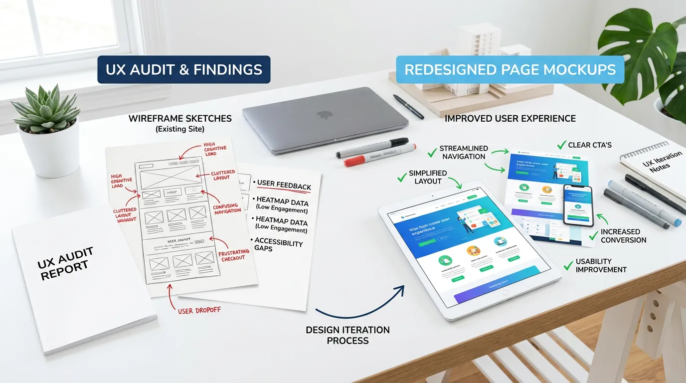
Service business websites are usually organized around how the company thinks, not how a customer decides. The navigation lists departments instead of problems. The user experience improvements service page opens with a paragraph about the company's founding year, then a stock photo, then finally something about the actual service on the third scroll. Pricing is never mentioned, so the visitor leaves to look for it and never comes back. There is no way to tell whether the company serves the visitor's city. None of this is a design failure in the visual sense. The site looks fine. It just does not answer anything in the order a person asks.
What it is
This user experience improvements work reorders the site around the way a customer decides. Navigation gets rebuilt around the words people use to describe their problem. The most requested services sit one click away, and the top level menu stays short enough to scan. Page structure gets rewritten too. The top of every service page says what the user experience improvements service is, who it is for, what it roughly costs, and how to start. Company history moves down. Trust signals go where doubt actually happens, which is usually right before the form, not in a logo strip at the bottom. Dead ends get removed. Every page gets a next step, and the service area is written in plain text so nobody has to guess. We also handle basic accessibility. Contrast, focus states, and readable text sizes lift conversion for everyone, not just visitors with disabilities.
Signs you need this
- Visitors land on a service page and leave without scrolling
- People call and ask questions the website already answers somewhere
- Your navigation has more than seven top level items
- Customers say they were not sure you covered their area
- Session recordings show repeated clicking on things that are not links
What is included
- Navigation restructure based on customer language and click depth
- Page template reorder so the answer comes before the backstory
- Service area statement placement so visitors can self qualify
- Trust element placement at the points of hesitation
- Readability pass: text size, line length, contrast, and scannable headings
- Dead end removal with a defined next step on every template
- Accessibility fixes for contrast, focus states, and keyboard navigation
- Search and filtering improvements where the site has many pages
Our process
Task based usability review
Week 1 to 2We define the three tasks a customer actually performs, such as confirming you serve their city, understanding what a service costs, and reaching a person. Then we time how long each takes on your current site.
Navigation and structure mapping
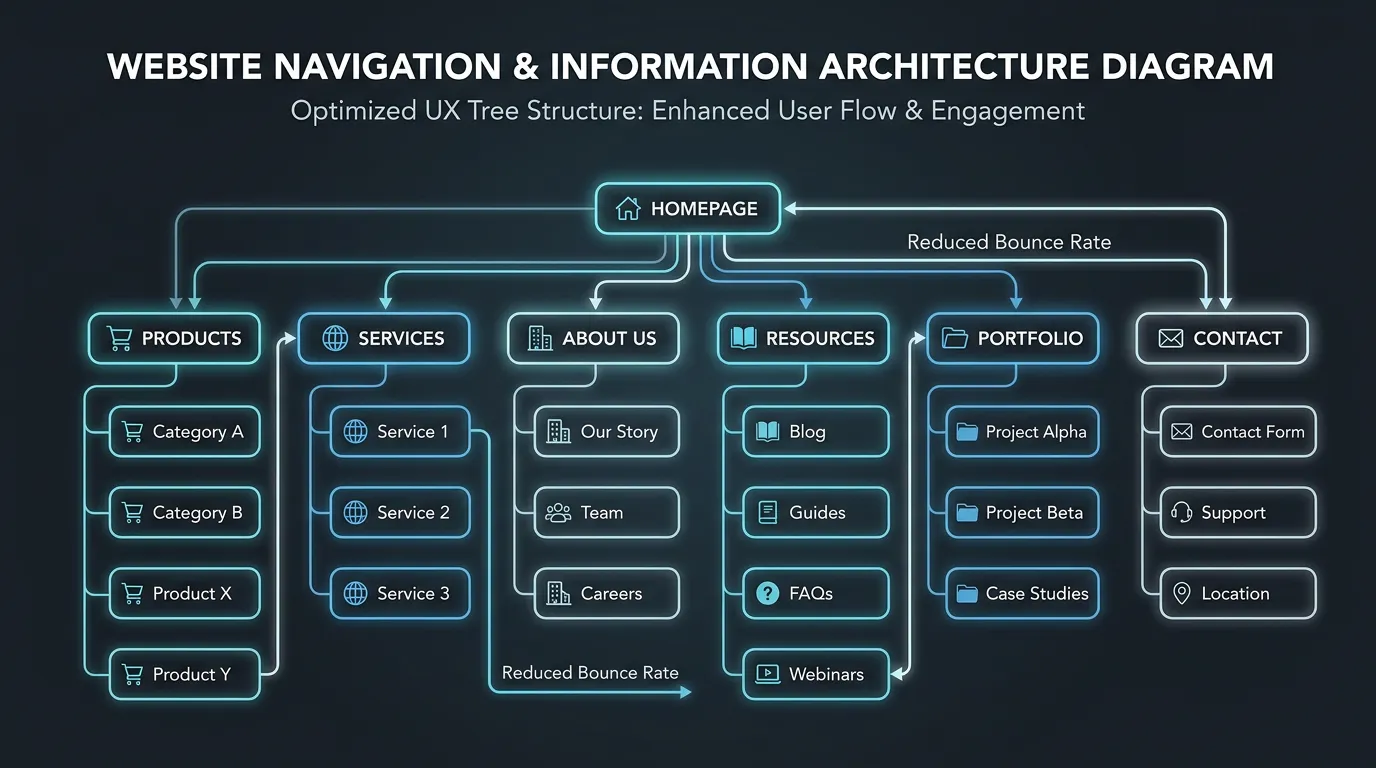
Week 2 to 3Every page gets plotted by click depth from the homepage. Anything important sitting three or more clicks deep gets pulled forward, and top level menu items get cut down to what people actually use.
Template reordering
Week 3 to 6Service and city page templates get restructured so the first screen answers what, who, and how much. Company history, awards, and mission statements move below the point where a decision is made.
Trust and clarity pass
Week 5 to 8Reviews, licenses, warranty terms, and real project photos get placed next to the moments of doubt. Vague claims get replaced with checkable specifics like response time, service area, and hours.
Validate with recordings
Week 8 to 12After launch we watch new session recordings against the old ones to confirm behavior changed the way we expected. Scroll depth, time to first meaningful click, and rage clicks are the fastest indicators.
Realistic timeline: Six to ten weeks for a typical service site. Behavioral indicators like scroll depth and click paths shift within two weeks of launch. Conversion rate changes need 30 to 60 days of traffic before the read is trustworthy.
The five questions a visitor answers before calling
People run the same short checklist on every service site. If a step has no answer, they leave and open the next tab.
Answer them in this order and the page order takes care of itself.
Menu labels: name the problem, not the department
Navigation fails quietly. Nobody complains about a menu. They just fail to find the page and go somewhere else.
The fix is usually word choice. Solutions, Capabilities, and Our Work mean nothing to a homeowner with a leak. Drain Cleaning, Water Heaters, and Emergency Repair mean something right away. Use the words your customers use on the phone, which you already have on your call recordings.
Two more rules help. Keep the top level short enough to scan in one pass, around five to seven items. And keep the phone number and one contact button outside the menu, so nobody has to open anything to reach a person.
The one hour usability test you can run yourself
You do not need a lab or a budget. Ask three people outside your industry to do these tasks while you watch and stay quiet.
Find out if we cover their city
Time it. Over 20 seconds is a real problem.
Find what a service call costs
If they give up, that is the finding.
Reach a phone number on a phone
Count taps. Two or fewer is the target.
Say what we do after five seconds
Close the laptop, then ask them.
Start the contact form one handed
Watch the keyboard, not their face.
Find your hours and after hours plan
Most sites hide both of these.
Name one thing they did not trust
The answer is often the stock photos.
Accessibility fixes that also lift conversions
The same changes that help people with disabilities help everyone reading on a phone in a parking lot. That is why we treat this as conversion work, not just compliance.
Four fixes carry most of the value. Body text at 16 pixels or larger. Real contrast between text and background, especially gray on white. Visible focus outlines so keyboard users can see where they are. And tap targets big enough for a thumb, around 44 pixels square with space around them.
For home services, healthcare, and senior care, a large share of buyers are over 55. Small light gray text is not a style choice for that audience. It is a wall.
UX questions owners ask first
Will changing the navigation hurt my rankings?
How many people do I need to watch to find real problems?
Should I fix speed instead?