Conversion Rate Optimization
Call to Action Optimization
What the button says matters as much as where it sits
- Timeline
- Rewrites and placement changes ship in 4 to 6 weeks
Call (714) 823-3164 or ask a question. Clear recommendations, even if we never work together.
Call to action optimization improves the buttons and links that ask a visitor to act. It covers the wording, the placement, the design, and the offer behind them. The goal is a next step that is obvious and low risk. It should also sit right where a visitor decides, not only at the bottom of the page.
Jump to a section
The problem
Most service pages have either no clear action or too many. A visitor finishes reading about drain cleaning and finds four choices: Contact Us, Request a Quote, Schedule Service, and Learn More, all styled the same, none explaining what happens after the click. Or the only button sits at the very bottom, so anyone who decided halfway through has to scroll past three more sections to act. And the copy is almost always the weakest part. Submit tells you nothing. Contact Us asks for a conversation the visitor has not agreed to yet. Meanwhile the phone number, which is the action most local customers want, sits in eight point gray text in a corner.
What it is
CTA work has four parts. Wording comes first. Swap generic verbs for the outcome the visitor gets, so Get My Free Estimate beats Submit, and Check If We Serve Your Area beats Learn More. Placement comes next. Put an action anywhere a visitor might decide, which usually means one above the fold, one after the main explanation, and one at the end. Mobile also gets an action that stays on screen. Then hierarchy. Pick one primary action per page and make everything else look secondary, because two equal choices make people hesitate. Last comes risk. The small text under the button should say what happens next, such as how fast someone replies and whether it costs anything. Not knowing what follows the click is the real reason people do not click.
Signs you need this
- Your buttons say Submit, Learn More, or Contact Us
- There are four equally styled actions competing on the same page
- The only way to contact you is at the very bottom of the page
- Your phone number is small, gray, or not tappable on mobile
- You have no idea how many people click each button because nothing is tracked
What is included
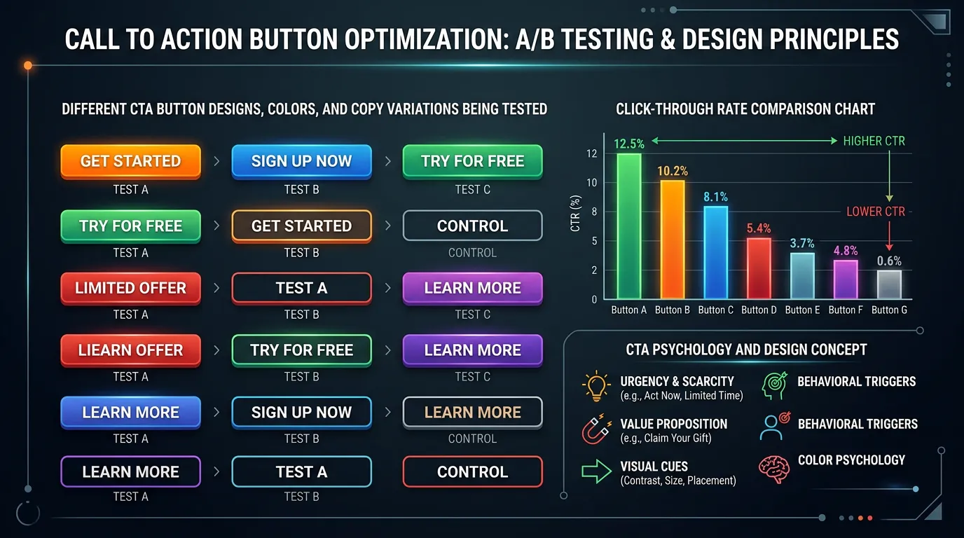
- CTA inventory across every page template with current click data
- Rewritten button copy tied to the specific outcome offered
- Primary and secondary action hierarchy per template
- Placement map showing where each action appears on the page
- Persistent mobile call element with tracked tel links
- Microcopy under each action stating what happens next
- Contrast and size adjustments so the primary action is unmistakable
- Click tracking events in GA4 for every action element
Our process
Inventory and measure
Week 1 to 2We catalog every button and link that asks for action, then add click tracking so we know which ones actually get used. Most sites discover that a button they argued about for weeks gets clicked nine times a month.
Decide the one action per page
Week 2Each template gets a single primary action based on what that visitor is realistically ready to do. Emergency service pages get a call. Research stage pages get a lower commitment action such as a guide or a service area check.
Rewrite and restructure
Week 3 to 5Copy gets rewritten around outcomes, secondary actions get demoted visually, and microcopy gets added under each action explaining response time and cost so clicking feels safe.
Placement and mobile treatment
Week 4 to 6Actions get placed at every plausible decision point, and mobile gets a persistent call element sized for a thumb. We check that it does not cover content or fight with a chat widget.
Measure and refine
Week 6 to 12Click through rates on each action get compared before and after, and the best candidates go into the testing queue for a formal A/B test if traffic supports it.
Realistic timeline: Rewrites and placement changes ship in 4 to 6 weeks. Click rate changes are visible within days because they need less volume than conversion rate. Full conversion impact takes 30 to 60 days to confirm.
Weak button copy and what to use instead
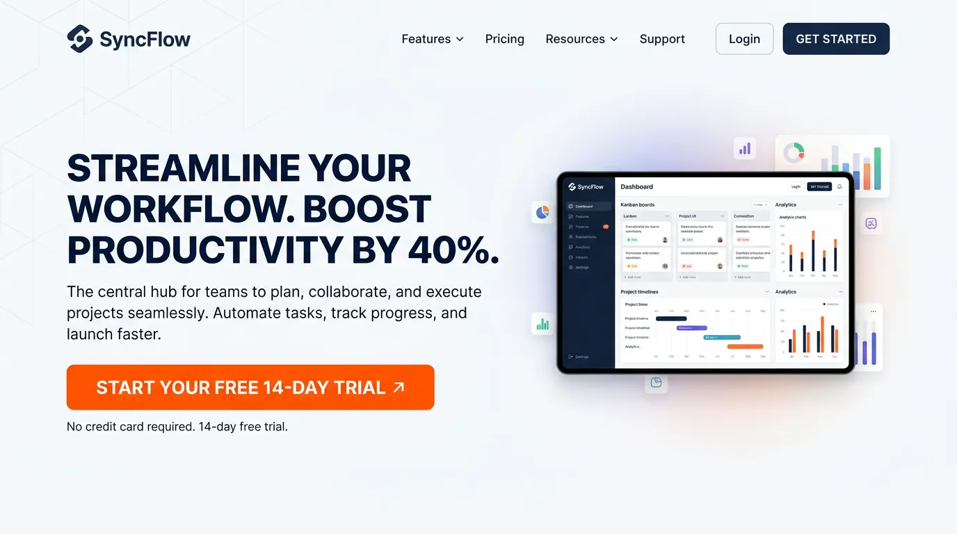
The button is the last thing a visitor reads before deciding. A generic verb makes them stop and think. A named outcome does not.
| Page | Common wording | Better wording | Why it works |
|---|---|---|---|
| Emergency repair | Contact Us | Call Now for Same Day Service | Names the speed the visitor needs |
| Service page | Submit | Get My Free Estimate | Says what the visitor receives |
| City page | Learn More | Check If We Cover Your Street | Answers the question they arrived with |
| Remodeling page | Request a Quote | See Project Costs and Timelines | Lower risk for an early stage buyer |
| Dental or clinic | Book Appointment | Book a New Patient Visit | Matches how new patients think |
| Blog post | Contact Us | Get the Repair Checklist | Matches the stage the reader is in |
Read the button on its own, with no page around it. If it could sit on any website, rewrite it.
Microcopy lines that remove the last doubt
The click is rarely blocked by the button. It is blocked by what the visitor thinks happens next. Will someone hound me? Is this a sales trap? Will anyone even answer?
One honest line under the button settles it. Free estimate, no obligation. We answer within one business hour. No card needed to book. Each of these costs nothing and takes a single deploy.
The rule is that the line must be true and checkable. If you promise a one hour reply, the office has to keep it. A promise you break costs more than the click it earned you.
Placement rules for calls to action
Where the action sits matters as much as what it says. These rules cover most service pages.
Do this
- Put one action above the fold, one after the main explanation, and one at the end.
- Repeat the same action instead of offering three different ones.
- Make the phone number a real tap to call link on every device.
- Keep a sticky call bar on mobile, sized for one thumb.
- Track each action as its own GA4 event so you know what gets used.
Not this
- Do not let the sticky bar cover form fields or the chat button.
- Do not style secondary links the same as the main action.
- Do not hide the phone number inside the hamburger menu.
- Do not put your only action below three sections of company history.
- Do not use a button color that already appears elsewhere on the page.
Match the ask to how urgent the job is
The right action changes with the situation the visitor is in. Urgency decides it, not preference.
A burst pipe at 9pm needs a phone number and nothing else. A kitchen remodel needs a cost range, photos, and a low pressure next step, because that buyer compares for weeks. A dental cleaning sits in between and suits a booking link.
So one site can carry three different primary actions. Emergency pages lead with the call. Big ticket pages lead with proof and a soft ask. Routine service pages lead with booking. Still one primary action per page, chosen by the job.
Common questions about buttons and call bars
Should the sticky mobile bar show a form or a phone number?
How do I track clicks on my phone number?