Conversion Rate Optimization
Website Form Optimization
Every extra field costs completions, especially on mobile
- Timeline
- Four to six weeks including the tracking period needed to see where abandonment happens
Call (714) 823-3164 or ask a question. Clear recommendations, even if we never work together.
Form optimization makes a web form easier and less worrying to fill in, so more of the people who start one finish it. The form optimization work covers field count and field order. It also covers input types, inline error handling, mobile keyboard behavior, spam protection, and what the visitor sees right after they submit.
Jump to a section
- The problem
- What it is
- Signs you need this
- What is included
- Our process
- Related services
- Where people drop out of a five field form
- Input settings that fix the mobile keyboard
- Error messages that help, and ones that lose the lead
- The thank you page is a wasted asset on most sites
- Form questions that come up mid build
- Questions
The problem
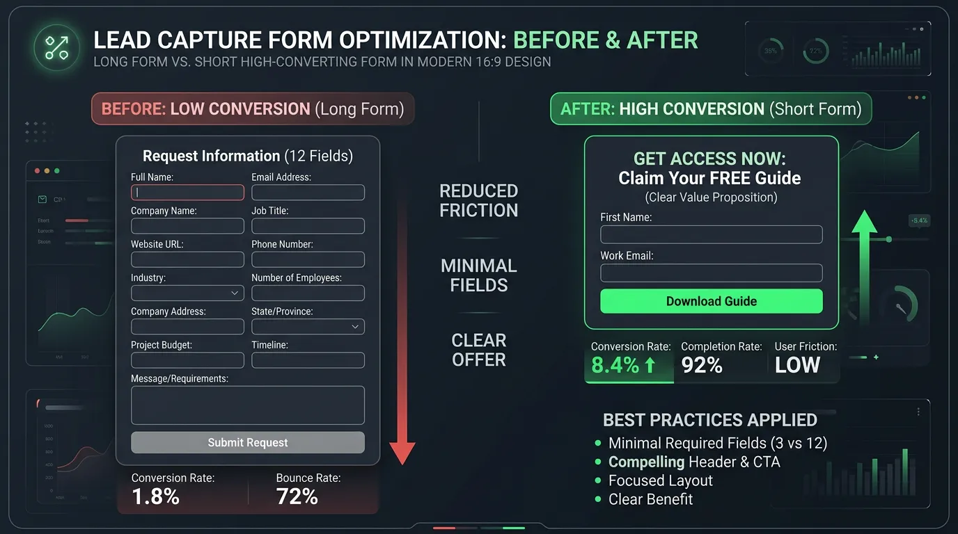
Forms are where interested people give up. A visitor who read the whole page and decided to contact you hits a form asking for first name, last name, email, phone, street address, city, zip, preferred contact method, how they heard about you, and a message, all required. On a phone. With a keyboard that shows letters when they need numbers. They start typing, mistype the phone number, get a red error after submitting that clears every other field, and close the tab. That visitor cost you money to acquire, wanted to hire you, and left angry. Nobody at the company will ever know it happened.
What it is
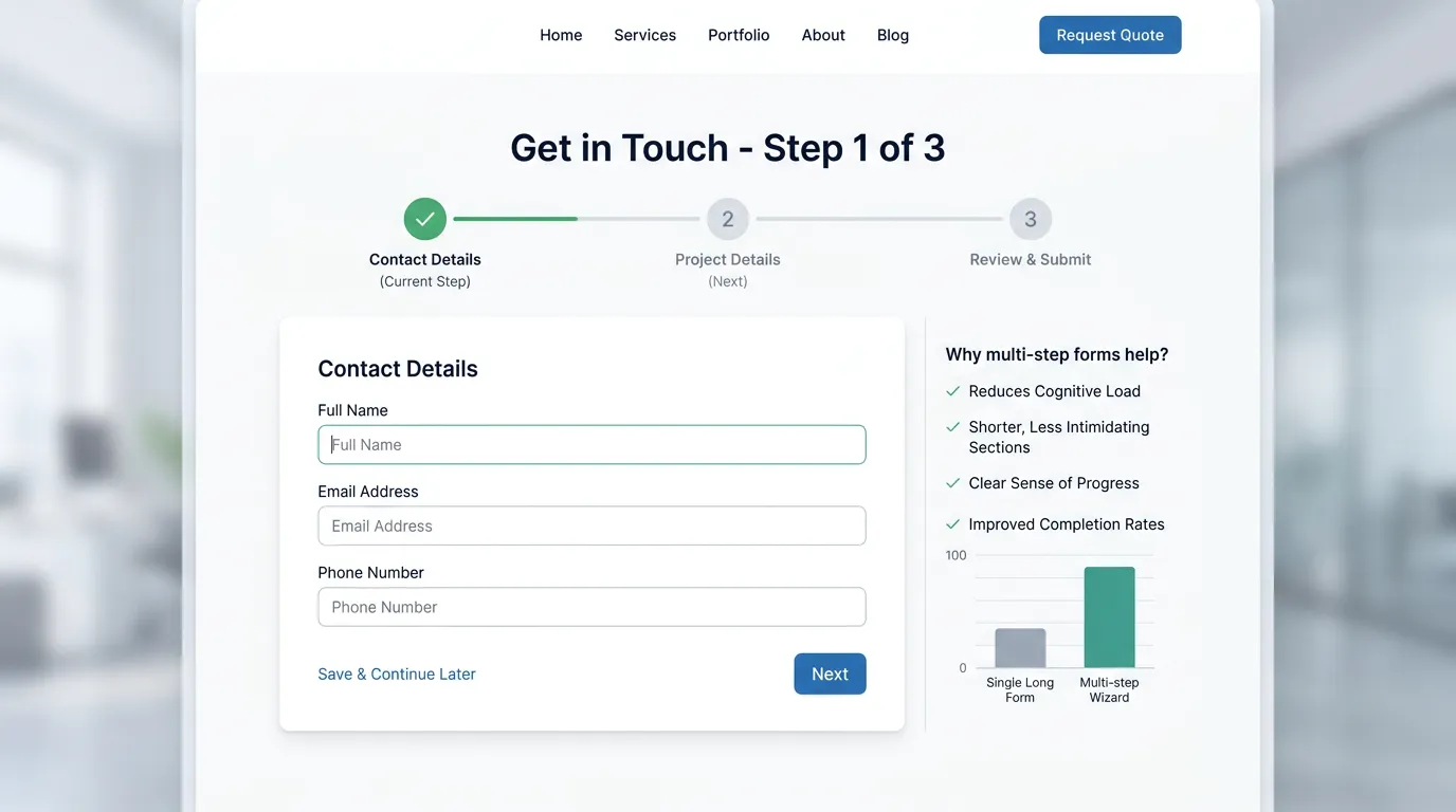
Form work starts by cutting the form down to what you truly need before you can respond. For most service businesses that is a name, a phone number, and one line about the problem. Everything else can wait for the call. Then the mechanics get fixed. Input types get corrected, so phone fields open a number pad and email fields open the at symbol. Autocomplete attributes let the browser fill in what it already knows. Inline validation catches mistakes as they happen instead of after submit, and error messages say what to fix rather than turning the whole form red. Longer forms that really do need more information get split into steps with a progress indicator, because a small first commitment raises completion. Spam gets handled with honeypot fields and reCAPTCHA v3 scoring, not a visible puzzle that punishes real customers. Last, the confirmation gets rebuilt so it sets expectations and shows that a real person got the message.
Signs you need this
- Your contact form asks for more than five pieces of information
- You get spam submissions and have added a visible captcha because of it
- People start the form and never finish, based on your analytics
- The phone field opens a letter keyboard on mobile
- You are not completely sure every submission reaches someone
What is included
- Field audit removing anything not needed to make the first contact
- Correct input types and autocomplete attributes on every field
- Inline validation with error messages that say how to fix the problem
- Multi step conversion for longer forms with a progress indicator
- Mobile layout with full width fields and thumb sized tap targets
- Spam control using honeypot fields and score based reCAPTCHA
- Form abandonment tracking showing which field loses people
- Confirmation page or message that sets response expectations
- Notification and routing check so submissions reach a real inbox
Our process
Abandonment measurement
Week 1 to 3We add field level tracking so we can see where people stop. Usually one specific field is responsible, and it is often the one someone added years ago for a report nobody reads anymore.
Field reduction
Week 3Every field has to justify itself against one question: do we need this before we can call the person back. Anything that fails moves to the phone conversation or a follow up email.
Mechanics rebuild
Week 3 to 5Input types, autocomplete, inline validation, and error messaging get corrected. We test by filling the form on a real phone with one hand, which is how customers do it.
Spam and deliverability check
Week 5We add invisible spam controls and then verify that submissions actually arrive. Broken notification emails going to spam are more common than anyone believes, and the symptom looks identical to having no leads.
Confirmation and follow through
Week 5 to 6The thank you experience gets rewritten to confirm receipt, state when someone will respond, and give an immediate alternative such as the phone number for urgent needs.
Realistic timeline: Four to six weeks including the tracking period needed to see where abandonment happens. Completion rate improvements usually show within two weeks of launch because forms generate frequent, countable events.

Where people drop out of a five field form
Abandonment is not spread evenly. Field level tracking almost always shows one step doing most of the damage.
Fix the worst step first. Cutting fields around a healthy step changes nothing.
Input settings that fix the mobile keyboard
Most mobile form pain comes from a few missing attributes. A developer can add all of them in under an hour.
| Field | Input type | Autocomplete value | What the visitor gets |
|---|---|---|---|
| Full name | text | name | Saved name offered in one tap |
| Phone | tel | tel | Number pad instead of letters |
| Keyboard with the at symbol | |||
| Street address | text | street-address | Address filled by the browser |
| Zip code | text, numeric mode | postal-code | Number pad, no letter guessing |
Test on a real phone. A desktop browser will not show you the keyboard your customer gets.
Error messages that help, and ones that lose the lead
Bad error handling ends more submissions than long forms do. The difference is whether the message tells someone what to do next.
Do this
- Check each field as the person leaves it, not after they hit send.
- Say what to fix, such as phone needs 10 digits.
- Keep everything else they typed exactly as it was.
- Put the message directly under the field it belongs to.
- Accept phone numbers typed with dashes, spaces, dots, or brackets.
Not this
- Do not turn the whole form red with one message at the top.
- Do not clear the form after a failed send.
- Do not reject a real address because the format did not match.
- Do not mark a field required when your team never reads it.
- Do not place the error where the visitor has to scroll back to see it.
The thank you page is a wasted asset on most sites
The seconds after someone hits send are the moment they care most. Most sites answer with the word Thanks on an empty page.
Use it instead. Confirm what was received, name the time someone will reply, and give the phone number for anything that cannot wait. Add one line about what the first conversation covers, so the callback does not start cold.
It has a practical job too. A real thank you page gives you a clean address to count as a conversion in GA4 and to import into Google Ads. Forms that only swap a message in place are harder to track and easier to miscount.
Form questions that come up mid build
Should the form ask for email or phone?
Is a chat widget better than a form?