Web Design and Development
Websites That Convert Visitors Into Customers
Three to eight percent of visitors taking action is the normal band
- Timeline
- Six to eight weeks for the first round on the top pages
Call (714) 823-3164 or ask a question. Clear recommendations, even if we never work together.
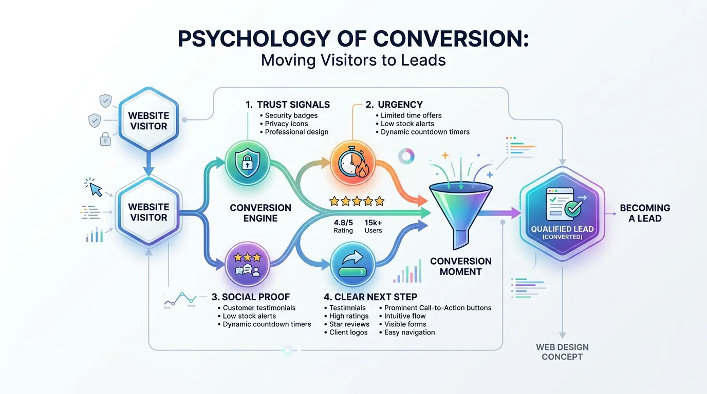
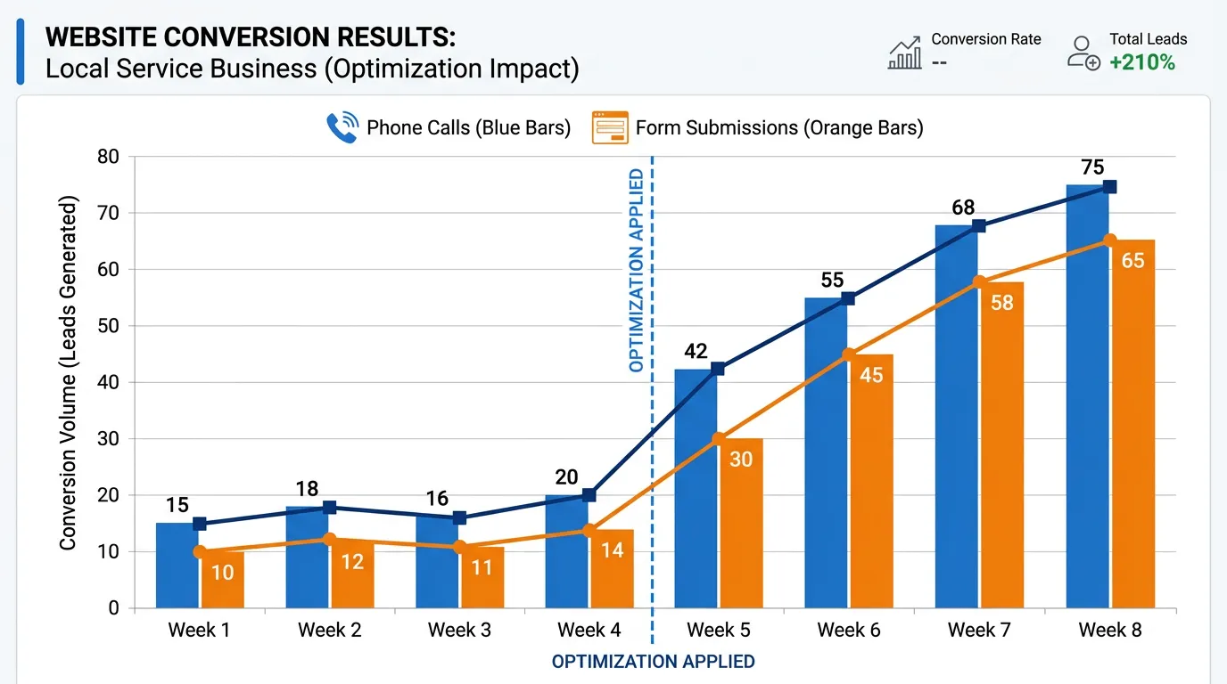
A website that converts turns a meaningful share of its visitors into phone calls, form submissions, or bookings. For local service businesses, that usually means three to eight percent of visitors take a lead action. The difference is rarely design quality. It comes down to clarity, speed, proof, and how few steps stand between arriving and contacting you.
The problem
A business owner spends 9,000 dollars on a website, gets compliments on how it looks, and six months later the phone rings no more than before. Nothing about the site is obviously wrong. It is modern, it has photos, it works on a phone. But nowhere does it say which cities you serve, the price range is a mystery, the reviews are two clicks away, and the form takes eleven fields. The visitor leaves not because they disliked the site but because a competitor answered those four questions in the first screen and this one did not.
What it is
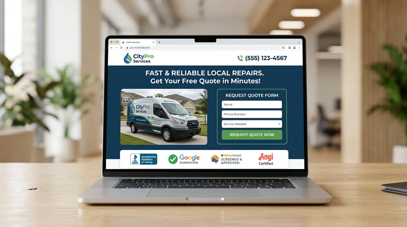
This is the approach and the benchmark, rather than one deliverable. A converting site does five things well. It states what you do, where you do it, and how to reach you in the first screen. It loads fast enough that nobody leaves waiting. It answers the money question, at least with a range or a starting price. It shows proof next to the claim, using real reviews and real project photos. And it keeps the path to contact short, ideally one tap. We measure your site against benchmarks for your trade, find the specific screen where people leave, and fix in the order that returns the most leads per hour of work.
Signs you need this
- You get compliments on your website but not more phone calls
- Your analytics shows plenty of sessions and very few conversions
- Nobody at your company knows your current conversion rate
- Your site never mentions price, even as a range
- Visitors call and ask which cities you serve
What is included
- Conversion benchmark comparison for your trade and traffic mix
- Lead path test counting the taps from landing to contact on a phone
- Heatmap, scroll depth, and session recording setup on top pages
- First screen rewrite for the pages that carry the most traffic
- Pricing transparency block using a range, a starting price, or a cost guide
- Proof placement plan matching reviews and photos to specific claims
- Form simplification with field by field justification
- Response time promise displayed and actually enforced with your team
- Prioritized fix list ordered by estimated leads gained
- Thirty day and ninety day measurement checkpoints
Our process
Benchmark and Baseline
Days 1 to 5We calculate your current conversion rate by page and device, then compare against realistic ranges for your trade. Sometimes the answer is that the site is fine and the traffic is unqualified, which is a completely different fix.
Find the Leak
Week 1 to 3Using heatmaps, scroll depth, and session recordings we find the specific screen where visitors stop. It is usually one place, not the whole site, and it is often the moment someone looks for a price or a service area and does not find one.
Fix the Money Pages First
Week 3 to 6We rewrite and rebuild the first screen of your two or three highest traffic pages before touching anything else. Those pages carry most of the opportunity, so improving them moves the total number fastest.
Close the Response Gap
Week 4 to 7Conversion does not end at the form. We check how fast leads actually get called back, because a two hour response destroys the value of a page that took weeks to improve. Sometimes the biggest fix is not on the website at all.
Measure and Repeat
Days 30 and 90At 30 and 90 days we compare conversion rate by page against the baseline, keep what worked, and move to the next page on the list.
Realistic timeline: Six to eight weeks for the first round on the top pages. First reliable read at 30 days of traffic. Meaningful compounding improvement over two to three quarters.
What One Point of Conversion Is Worth
Run the math before you spend anything. Here is a made up landscaping company, so the numbers stay clear.
They get 900 visits a month and websites that convert at three percent, which is 27 leads. Move that to five percent and it is 45 leads from the same traffic.
If they close 40 percent of leads at an average job of 1,200 dollars, those 18 extra leads work out to about seven more jobs a month.
Now weigh that against the cost of the fix. The same math explains why small sites should make bold changes. At 400 visits a month, a one point lift is invisible in the data.
Where Visitors Actually Leave
Most sites have one leak, not six. Match your own numbers to a row here before you redesign anything.
| Where they stop | What your data shows | Likely cause | First thing to try |
|---|---|---|---|
| The first screen | Exits under fifteen seconds | No answer to what and where | Put the websites that convert service and cities in the headline |
| The price question | Deep scroll, then exit | No number anywhere | Add a range or a starting price |
| Service area check | Local visits, no calls | Nothing proves you work there | List every city you cover |
| The form | Many starts, few submits | Too many fields | Cut it to four fields |
| Between pages | Four pages, no contact | No next step offered | One clear action per page |
| After the form | Leads that go cold | The callback took hours | Answer inside five minutes |
The last row is not a website problem, and it is the one we find most often.
Writing a First Screen That Answers Fast
The first screen decides more of the outcome than everything under it. These rules come from watching people use service sites on a phone.
Do this
- Name the websites that convert service and your cities in the headline
- Put a tappable phone number where a thumb rests
- Show proof early, like a review count or years in business
- Give a price signal, even a service call fee
- Say how fast you answer, then hold your team to it
Not this
- Do not open with a slideshow or a welcome message
- Do not use a stock photo of a crew you never met
- Do not stack four buttons of equal weight
- Do not hide your service area on another page
- Do not cover the first screen with a popup
Most sites do not have six problems. They have one screen where people quietly give up, and nobody has ever watched it happen.
Calls, Blogs, and Speed to Lead
How fast do I really have to call a new lead back?
Should phone calls count as conversions?
My service page converts well and my blog converts at zero. Is that bad?